Rethinking Vehicle Inventory
I combined dealer interviews with a quantitative survey to develop and validate a responsive UX/UI concept for managing large vehicle inventories.
Project context
AutoScout24 is Europe’s largest online car marketplace, providing consumers, car dealers, and partners with a comprehensive platform for buying and selling vehicles online. This case study focuses on a new concept for the vehicle inventory interface used by dealers.
- Company
- AutoScout24 GmbH
- Role
- Senior User Experience Designer
- Period
- 2021
- Scope
- Discovery, responsive UX/UI redesign, and validation of the vehicle inventory experience
- Tools
- Figma/Sketch, InVision, Mockflow, Easyfeedback, Mouseflow
Outcome
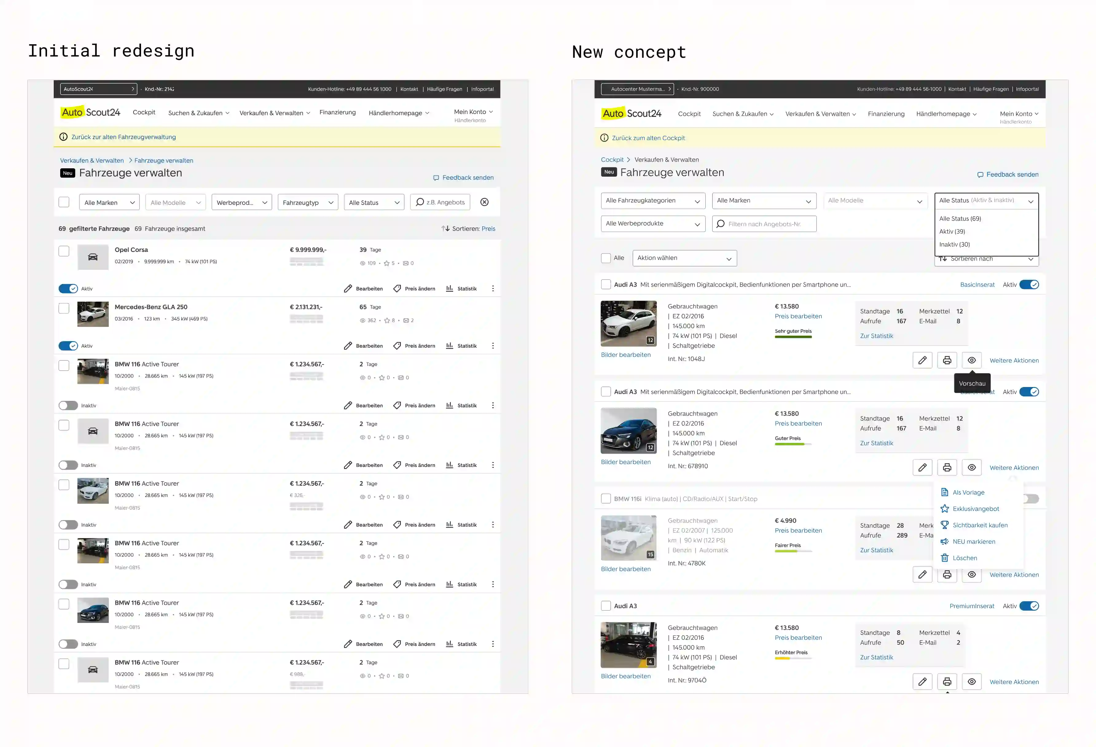
The starting point was a redesign that had failed to gain acceptance among dealers. Some reverted to the previous vehicle inventory interface rather than use the new version. I then developed a new vehicle inventory concept validated with dealers. In a direct comparison, feedback on the concept was consistently positive. Its improved orientation and complete feature set stood out in particular. Implementation was subsequently deferred.
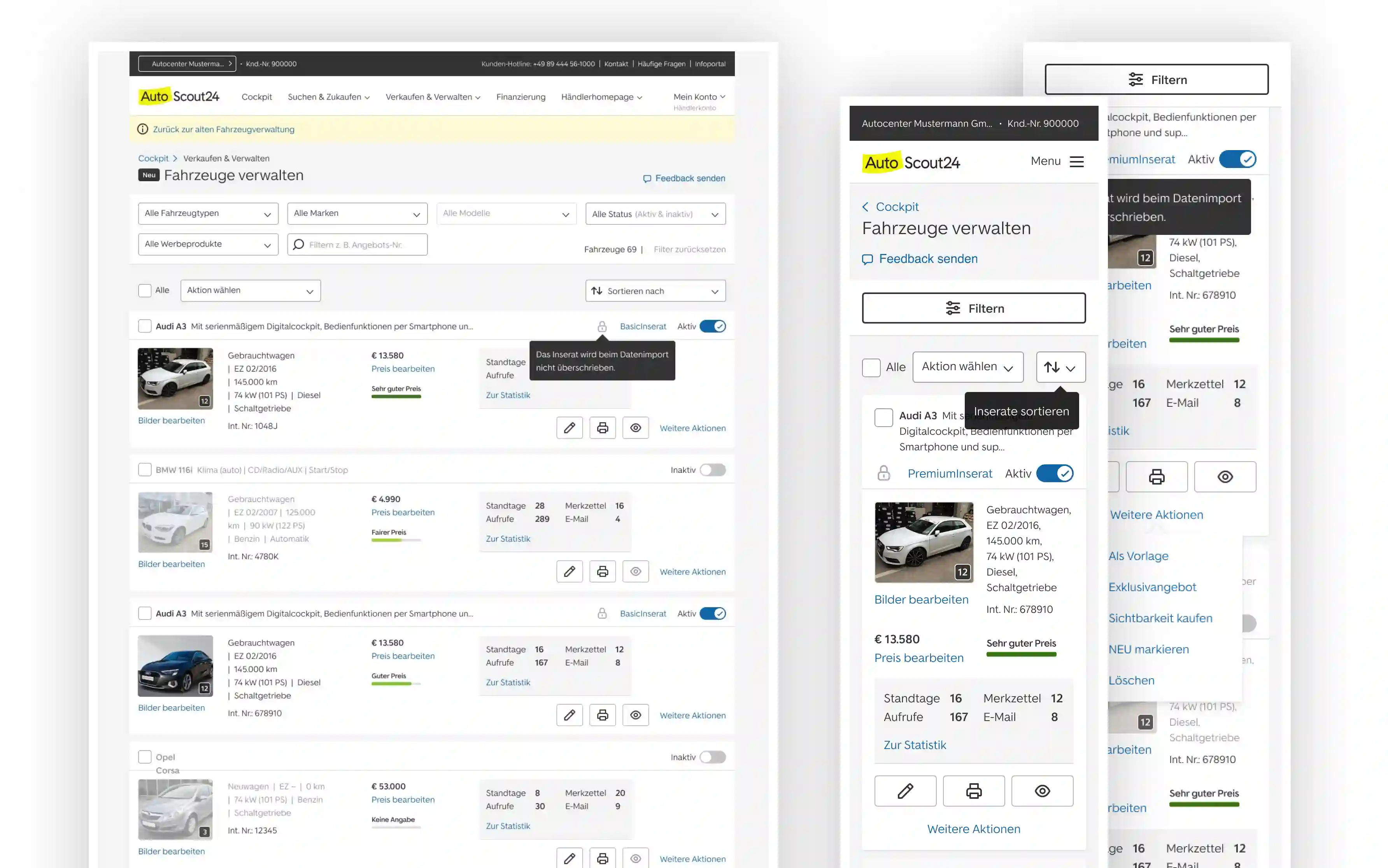
- A new information architecture groups each vehicle’s image, key details, price, performance metrics, and status in a clearly structured card.
- Common actions sit directly on each card, while less frequently used functions are grouped in a secondary menu.
- Filters, sorting, and bulk actions make it easier to work efficiently with large inventories.
- A consistent card pattern preserves the full set of information and actions across desktop and mobile, adapting the layout to the available space.
My role
As Senior User Experience Designer, I was responsible for discovery, prioritization, and the overall UX/UI concept. I designed and conducted the quantitative survey and dealer interviews, identified the key workflows, and translated the findings into wireframes and interactive prototypes. Product logic and business requirements provided the framework; I was responsible for selecting the methods, defining the interaction concept, and developing the UI.
Skills
Starting point
Before I took over the project, the vehicle inventory interface had been adapted to the new AutoScout24 design and implemented responsively. However, the redesign made familiar workflows more difficult, so dealers used the option to return to the old version. Small vehicle images, truncated titles, a weak visual hierarchy, and hard-to-find actions made large inventories difficult to scan. Of the 63 dealers who assessed usability in a survey, 46 percent rated the redesign as not user-friendly. The goal was to create a solution dealers would accept, allowing the old version to be retired and ending the need to maintain both systems in parallel.
The challenge
The central challenge was not to show less information, but to prioritize it effectively. Dealers needed a wide range of vehicle details, performance metrics, and actions directly in the inventory list, while the interface still had to remain clear and efficient across desktop and mobile. Following the negative experience of the initial redesign, the new concept also had to rebuild lost trust.
- Key vehicle information had to be quickly comparable across listings without requiring dealers to open each vehicle individually.
- Frequently used actions needed to remain directly accessible, while less common functions could not compromise clarity.
- Filters, sorting, and bulk actions had to work reliably across large, varied inventories.
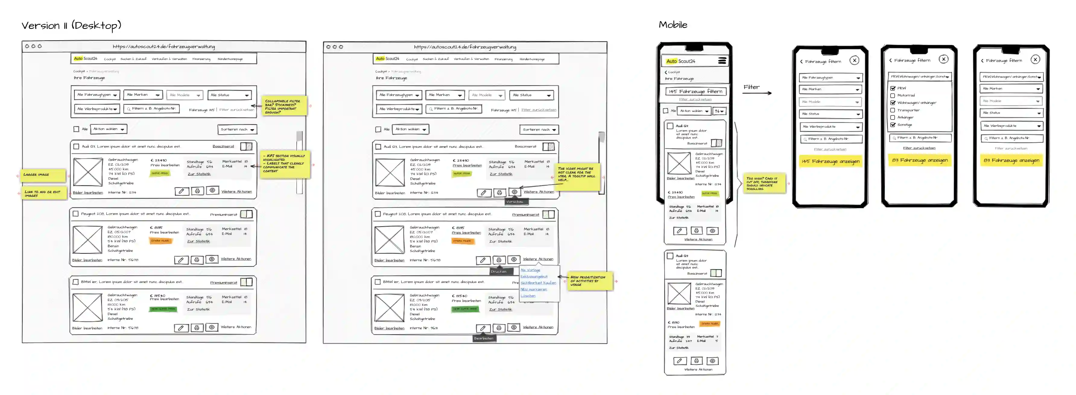
- On mobile, the same feature set was required but needed a different spatial organization than on desktop.
Approach
The process moved from comparing the two existing versions through quantitative and qualitative research to designing and evaluating the new concept. The decisive factor was deriving the new structure from dealers’ actual workflows rather than simply giving the interface a visual refresh.
- The process began with an analysis of the limited usage data, the old vehicle inventory interface, and the initial redesign to identify the central issues.
- A quantitative survey and qualitative interviews with car dealers revealed which information, features, and workflows mattered most in day-to-day use; of the 118 dealers who answered the prioritization question, 67.8 percent each named the vehicle image and the vehicle data as particularly important.
- The findings informed a new information hierarchy, responsive vehicle cards, and a clear distinction between primary and secondary actions.
- Dealers then compared the interactive concept directly with the initial redesign, and their open-ended feedback informed further refinements.
Team and collaboration
- Team
- Sole responsibility for research and UX/UI design
- Way of working
- Independent project work in coordination with Product Management; Sales facilitated contact with car dealers
Individual dealer data is not shown for confidentiality reasons. I’m happy to discuss the research approach, the interaction concept, and the decisions behind them in person.